
I love the shapes here and how they work with one another. It's a great poster with subtle type to compliment it.
Thursday, January 21, 2010
Trekkies GO!

I like this propaganda-like poster a lot. Trekkies are so overlooked in this day and age but now have come back into season with the advent that is J.J. Abram's "Star Trek". The iconography here is easy to identify and the message is clear.
Surrogates Movie Poster

I like this poster, although I'm not quite sure the sword-wielding school girl matches quite with the motiff of the movie, I do enjoy the same technique derived from the original posters, to be applied in this case. Reminds me a bit of my own work in robot academy.
Living Naked (have some fun)

living naked (have some fun), originally uploaded by Rétrofuturs (Hulk4598) / Stéphane Massa-Bidal (b.
I like this series. Retro photography with a modern tint and the right type to match, but a modern message.
Small Wonders 1

I love retro-comic book style and take that, in this case an old school nick fury, and some great collaging and you got some great work. Thumbs up here!

Nike Blazer-Hi "DHARMA INITIATIVE EDITION"

On the heels of the last season of "LOST", one might say "it's about damn time". The Dharma Initiative, the hippie organization from the show "LOST" finally get kicks to match up with their plain khaki uniforms and jumpsuits. Designed to match the supplies distributed throughout the island, these shoes definitely fit the shoes they're trying to fill. Now it'd be great, but also a little weird to see someone actually wearing these on the island.
Source: hypebeast
Gorillaz New Single Artwork
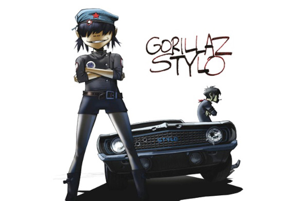
I've always been a fan of Gorillaz album art and music video style since they first hit the scene. Now returning with a new album "Plastic Beach", their first single entitled Stylo has some great new album art. You dig?
STAR WARS x ADIDAS

Adidas Concepts Store in Hong Kong has been gifted with a STAR WARS event. Their new concept items featuring a collaboration between Star Wars attitude, characters, and themes has been fused with Adidas footwear and clothing. The result is pricey, but well worth it. For me, these skywalker kicks would be a great addition to my collection.
David Choe's New Show Feb 5 - Mar 24

David Choe is hitting up Upper Playground with a new show featuring his latest work. This large scale mural definitely has a ton of detail here mirroring sites close to his heart: Los Angeles and Vietnam. Hit up upperplayground here for more info.
Thursday, January 7, 2010
Robot Academy: Battle Angel

Simply put, Rihanna's 'mohawk punk' days have reminded me a bit of the likes of Grace Jones from 007. I wanted to put a robotic spin on her since I like how she has gotten really creative in many of her videos. i wanted to create this amazonian robot, with a bitchy attitude, and strength from not only her looks, but also her gear.
I got inspiration for her robot body from Battle Angel Alita, also known in Japan as gunmn. I wanted to concentrate on shape and form opposed to intricacies i usually draw in my robot drawings.
You can read more in my flickr by clicking the image.
The Demon Boy & the Black Sheep

Two additions have finally been finished. The two are for my WWRTW series. It's been a while since I drew any, but these two have their individual stories.
How 'demon boy' was born is simply put. I was getting tired of going through just the animal kingdom and wanted someone with a less familiar form, and that could be played around with. I just started sketching a couple of weeks ago and came up with this guy, with more play on the color black and simple shapes and linework. It was rather simple to draw and I imagined a punk kid like macauy culkin meets evil charlie brown. I really had a good time drawing this one.
"The international" came to me through just a phrase: "Black Sheep". I played around with the idea for a while, and for some reason he kept turning into a harlem globetrotter, and that got annoying. I went through four iterations before I came to the one i have today, which is a mix of def jam, samuel L jackson, and tokyo kawaii.(below)
Monday, January 4, 2010
concept skull

Skulls have always been a strong icon in pop culture, especially with the rock/alternative world. Skulls have been somewhat overused, and just using a plain one doesn't say as much anymore. I love to always see reinterpretations and this is an example of that. I think this brings some freshness and many points of interest to look at.
This would definitely work well as a poster, over a t-shirt since a poster has 3 points of view, where you look at the skull from afar and the interest catches you to get closer to see the details. A t-shirt isn't customarily watched and read on you for a long period of time since you usually only get a glance as someone passes by with it or you walk by.
Mazinger Z 1979 japan toy popy original

I actually owned one of these when I was a kid, but he was embossed in a gold metallic finish. The arms, of course, also shot off and you'd have a hard time keeping track of them and end up usually losing them in the end.
Here Strikes Lightning!

There's a big contrast, i think, in american and japanese comic design. This definitely reminds me of a drawing i'm trying to finish but haven't had much time or luck getting to. I love black drawings because all you have left are highlights to tell the tale. Its strong and makes a big statement.
YEAR100

Shout out to Paul Pope, who was introduced to me by my friend Aaron. I like that you can see the pen strokes and just the raw nature of it. It makes it more one-of-a-kind and reminds one that old school aint' dead.
Sesiones CMYK III

It reminds me a bit of my cat drawings, with the throwing up movement. I like the contrast in colors, to make the colors really pop here. I think this would be a great advertisement for some paint company or noodles or something.
CMYK

I thought this was a good invention. I don't do graff myself but i know many that do, and its an all in one solution, but also refillable. It cuts down on costs but question is, what happens when u refill it with a different color? I am not sure how the mechanism works exactly but if its merely the cmyk color basics, I think it'd lead much to be desired since graff is mainly done in vibrant colors.
Source: hypebeast
Subscribe to:
Posts (Atom)