
So it started out small and grew. The idea was simple, set up something unexpected, borderline gross and run with it. Don't think about whether its weird, whether people would like it or not or what they'd think.
I saw a news report on tv the other day about these dolls that were selling in taipei and how the weirder it was, the more it'd sell. I guess the attention is one thing, but i think it gets the brand out there, negative or positive publicity.
So now its the the concept of cats starting to come out of their shells, their human shells. Now they're starting to take over and show off their personalities.
The two parts are fun to do. It's a different method from my other works, since the cats are mainly done in photoshop and the humans are completely done in illustrator. Putting it together is a more difficult task, to get the sizing right.
The slogans though, since it started as a teaser with "it's coming" is now set as the theme.
Check out more on my flickr at www.flickr.com/photos/teacher_evan
or
directly to the set at http://www.flickr.com/photos/teacher_evan/sets/72157622781887329/
Monday, November 30, 2009
It's Funny?
corrid rabbit

Shaped like a revolver, so appropriate. I didn't understand the imagery right off the bat but from afar, i totally got it. I like the expression of the rabbit, totally appropriate.
Dalai Yorke

This guy's got some amazing work. His photography is elegantly filtered to bring out this quality in the characters. I like the model's expression too, which doesn't say too much but speaks volumes in the mind.
Digital Collage for Raso

Great symmetrical collage here. I especially like the inclusion of mazinger z up at the top. The psychedlic color scheme reminds me of a mix between old French posters, 70's hippie posters, and heavy metal iron maiden-like posters.
bmx nirvana

I like the fluid movement here and execution. Raid71's a bike enthusiast, more specifically bmx so its great to see how people can succeed based on their passion. Really great.
Sunday, November 29, 2009
A Design Report: Taiwan
So my quest to see the design world in Taiwan has come to a long-awaited thesis. Taiwan, an odd place to me that I can’t say represents something as prominent as Japan in the world, is a curious creature. It’s hard to put my finger on it, but I can say what I’ve seen and experienced in my short, yet fruitful design life has given me a lot of perspective and a good scope on what I should look out for.
My foray into studying the design climate in Taiwan is to 1)see the level of creativity and depth the art movement Taiwan is at, 2)see what the community takes to and understands, 3)see if it is feasible to bring a new idea here as basic a platform as a t-shirt line, but as complex as something new and different in art.
Upon first arriving here and beginning my research, I did some online searches and found an article about how Taiwan lacks creativity. The award winning entrees into competitions have been found out to be rehashes and recycling of ideas others have done from all over the world, which is a bit of an embarrassment to say the least but also to be expected. It states how Taiwanese designers are undereducated, and hence uncreative. However, I do feel you can still be creative without the education, but it does help and give you a deeper understanding of the craft.
I visited the national museum of fine arts in Taichung and the one bit of pop art I found was an exhibit juxtaposing pop art icons in Japan(and Taiwan) like mazinger-z with gold idols like that in Thailand. I found that the most engaging and relevant to the art movements in the pop-culture world. The remainder of what I’ve seen in museums in Taipei and Taichung are relatively traditional. Calligraphy, historical photography, and abstract painting were the majority of what I saw. A movement to move the abstract art world towards a direction towards more relative pop platforms is a good idea, but I have yet to foresee that happening. Art in itself remains somewhat set apart.
Something to notice is looking at street signs and billboards and how for the most part they all look to be done by the same person. That may even be the case, but signage lacks a level of sophistication and innovation that I have seen in other countries. It could be rooted in color choice and local superstitions, but that could also not be the case and we could just have a lazy designer.
The culture of Taiwan is to make money, and since they rely more on importing than exporting, the Taiwanese consumers would not know as much if they were being swindled or dealt a recycled idea. Even if they did know, I don’t think they would care that much because they’d pay less for something quite similar to the real thing, which is quite different compared to the idealism of Hong Kong. Case in point is a brand I spotted, which I saw in a department store. I think of it as “almost BAPE” since they use a similar light colored camou and the face of their symbol/icon is so close to the “Planet of the Apes” face but not quite there. I do notice the BAPE store in Taipei usually empty but then again, I think they want it that way; peaceful and catering to the ones that are worthy of the brand. But at the same time, the way the economy is and Taiwanese people are, only a handful are gutsy enough to put down enough cash for some real authentic BAPE. I told my friend that I would think it is so shameful to do something like copying a brand because, not only is it blatantly obvious and they can get away with it, but I just have too much respect for some designers in this world that put thought into their work, to take that and claim it as my own and be as mindless as to just copy and not think up my own work. I can’t even begin to imagine how planning sessions are for the designer who just rips off another’s work.
Currently succeeding trends have been Japanese and American imports that are sold at boutiques and department stores, but that’s high end. As much as these t-shirts are popular in terms of design and visibility, a problem is whether they sell at the right price points and to the locals. As far as I’ve seen, teens to adults still wear t-shirts, especially due to the climate, but the English is a little all over the place. The messages are fairly simple, with some sort of iconography with accompanying text that makes little sense. It’s similar to japan with things like LOVE, HAPPINESS, PURE 100% but they’ve also improved in their grammar(a little bit) and punctuation. In Taiwan, it still remains to be quite a problem as spelling and meaning are absolutely lost. Think of it as Westerners have Chinese tattoos which make little to no sense.
I think the grammar issues are less of a problem in terms of understandability and comprehension, but if products in Taiwan and the “made in Taiwan” moniker are to have a more positive and renown image, then exportability is a factor and Taiwanese brands need to excel in all aspects beyond competitors and quality needs to be more closely looked upon over quantity and sales. You may have a cheap find for the masses, but whether its special, lasts, and retains its image amidst others is another thing. Lasting quality, functionality, and lasting interest. These are things I’m looking towards.
There are a few brands I saw as unacceptable, and a tad tacky. BSX has a bape-like Milo-esque iconography. The problem is its too similar and the characters they have are unoriginal. They have Ultraman, Robocop, spiderman, wolverine, etc and Lu Guang Zhong. The last one is the only original one I’ve seen, and that one I’ll give them but the others are beloved trademarks that have no message or purpose rather than to use their status. It’s one thing to take an icon and add upon it for a message or a given purpose or theme, but just to use the likeness for no intended purpose is shameful.
Ecstacy is another brand, trademarked with some sort of hose-like SD creature. This one I just pass by but rarely take a look. The artwork is too simple and has been rather the same for years, that there isn’t much worth of development or improvement. It’s one thing to have a trademarked icon like POLO, but this is just a cartoon character which is not interesting enough to follow.
Powpowpow.cc is a brand my friend Honda showed me and initially I was impressed. It almost had the same business model I had wanted, to give artists that had not following or background a chance. Think of it kind of like threadless.com sold in stores. Some of the designs I saw were not bad, although the subject matter is questionable. However, after some review I found it not what I was looking for. They let almost anyone in, and have no quality control. The artists seem too amateur, with no sense of any formal training and guidance as to choice of subject matter. Juxtaposing iconic figures like Ronald Mcdonald to Cookie Monster with a concept like cannabilism might sound good on paper(or maybe not that even), but the execution was not on par for sale in stores and the overall drawing lacked a refinement I would expect for the price point. Overall, pretty darn disappointed with the lackluster designs(almost 90% awful in my eye).
So in my review of what didn’t work in Taiwan, I have concluded that there is a lack of a good eye, which is missing in a lot of shops in the world. I’ll still find the same lame designs in the U.S., Japan, etc. Nobody’s perfect, but its all a call to action to save consumerism and improve quality by upping the standards, rather than relegating to rehashing the subpar for an extra quarter.
Current brands I have found to have acceptable quality are Pizza Cut Five and Graniph Design. The former being a Taiwan company, I felt the presentation is great but the t-shirts were under-utilized. I was unsure that people were jumping on and grasping on to the brand’s image, and although graphically they were engaging enough, I still felt they were rather flat and needed an extra push to take them off. The latter, is a Japanese brand that has plenty of cool t-shirts with some nice motifs I recognize from famous artists. However, I’m not entirely sure people can tell the difference between this design and the ones they can find on the night markets.
What I looked for in these brands were soft material, softer paint, and complexity of design. T-shirts like Hanes beefy tees are easier to find, and are not comfortable in the long run and wrinkle upon drying and wash. They are not the best at handling heat either. Cheaper paints are bolder, with less depth in color(like gradients), are thicker and peel and wrinkle after a few washes, and smell bad like chemicals. IN terms of design, I’m looking for something different, more importantly humorous. The consumer needs to feel special, and when they see themselves in the shirt, they need to have a conception of what they’re wearing or enjoy it. The plain answer is I like this design because “it’s cute”. The answer I’m looking for is, “The concept reminds me of a dream I had and makes me smile when I see it in the mirror”. It’s a hard goal to attain, but I like the challenge.
Trends in terms of design are very simple. Cartoon figures, very simple SD forms, flat non-shaded imagery. These are mainly “born” in Japan and or are rehashes of Japanese designs. Designs are plastered on t-shirts with flat paint, puffy and perhaps a little to mechanical in my eye, and many times not done with the best eye for quality. Upon examining the consumer and the product, I find consumers are drawn to cartoony figures as a trend, with cute factor being where design is at this point in Taiwan. Consumers don’t necessary look at the quality as much so as much as you have your share of department stores, night markets, and boutiques where the t-shirts are hung on racks with plastic covering, they all don’t matter one bit when it comes to quality and utilization of the design space.
In the U.S. we have more flocking and full coverage of the t-shirt area as a while compared to the canvas area just being front or back. Although this is just a trend you can find a la “Ed Hardy” or “Affliction” t-shirts, its something perhaps underutilized or explored here leading to a very one-sided and pigeon-holed view of fashion. The design area is a big factor in t-shirts and is something that is quite unexplored. Rather, if there are t-shirts that go against the trends, they are usually imports from the states, and therefore many times its not as visible.
Currently the trends in Taiwan are relatively slow and I find for the most part, because of the economy, people are quite poor and unable to fully grasp “taste” and choose as one should when looking for their own personal style. I find some people quite capable of emulating a style that you find in the magazines, something you can see a level of preparation and creativity. However, this represents 15-20% of what I see, while the general population is still stuck in what I call “lazy fashion” which consists of sleepwear, worn out tennis shoes, and streetwear. The GQ trend of H&M is still relatively unexplored as people don’t know how to put it together here. Slim fitting shirts are available but are people ready or able to put It together is another question.
My vision thus far has been to create something, I now realize, is similar to the Artsprojekt motto of liberating artists and trying to create a platform of availability to the masses. However, I would first start with myself as the sole contributor and experimenter. I want to concentrate on creativity and quality, two key aspects. I want the price point to be moderately affordable, but it depends on the line. I’d start with a general more affordable line but I guess depending on the theme, the seasonal design would have to be affordably made. I’m going to opt out of two simple of a design as it will become just a competitor of the pre-existing. Instead, I’d like to start a trend and create and inspire competitors for myself. I want to explore new avenues of design to try and appeal to the masses and influence how you wear a t-shirt. Coupling a design with your current wardrobe is something not very well thought out. Sure, you can go with a jean or shorts, but that doesn’t take much thought. What if your shirt complimented your pre-existing wardrobe, that would be awesome and requires a lot more thought and depth on the consumer, but its well worth it.
I wouldn’t want to dwell on a certain idea for too long, but rather keep it moving and reinventing itself. My whole purpose is not just to make a profit, but to inspire a new trend to move forward the movement and elevate the quality of work here. So for instance, if you look at Uniqlo there is such a varying level of designs ranging from designs for girls, designs from European graphic artists, tributes to cartoon characters, etc. That is the level I am looking for, a platform and space that is new, different, not overly self-promoting, but rather letting the material speak for itself and having a presence and visibility that spreads through word of mouth rather than over-marketing. I want it to have some grass roots beginnings, some very basic beginnings and a positive experience.Thursday, November 26, 2009
Tu seras là?

I've been seeing a lot of animal hats lately. Well, lets not forget to mention all the animal hats I've been making in the last month. Anyway thought this pic was relevant.
Verbal on November's OLLIE

This is a bit late, but I pass by this mag every day now as it is laying in my room. I bought it yesterday but saw it for a while on the racks but just never saw a good moment to pick it up. In November's issue of OLLIE, Verbal, one of Japan's most influential harajuku fashion starters is once again gracing the cover for some sick threads. Although i preferred the last one he did a year ago or so, this one's great too.
Dolls... i THINK tofu related

Stationary stores in taiwan are pretty awesome. They're filled with some of Japan's best innovations. Also, cute figurines with amazing craftsmanship. Although I'm not in the market for this stuff anymore, I do still find it fun to watch.
Tuesday, November 24, 2009
Rated R
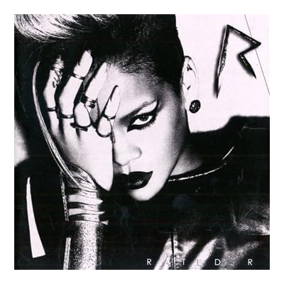
Big shout out to Rihanna for the debut of her 3rd album, "Rated R" in stores now! After a clean run through, I didn't find any hiccups. Well put together, elegant and strong this third album compiles and "picks up" after the drama and history of events with Chris Brown a year ago, and it really shows the great craftsmanship put into hte lyrics to explicitly convey the raw emotions of this resilient talent.
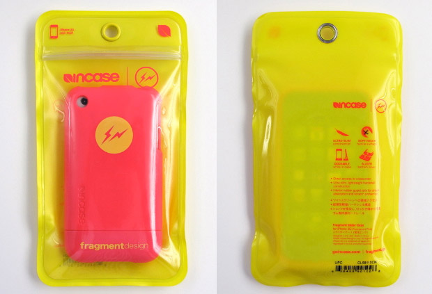
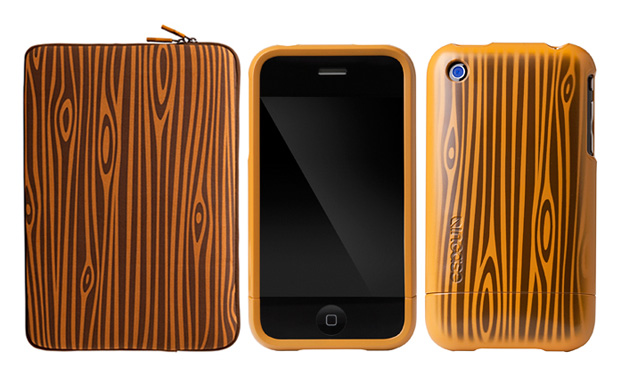
iPhone skinzZzZz
However, I found some tasteful choices that I thought I might share, whether you know about it or not. These noteworthy choices are clickable to their sources, so check them out for more information, and some are available for purchase if you're in the states.
A second design by reknown Japanese designer Fujiwara Hiroshi. Credit: hypebeast
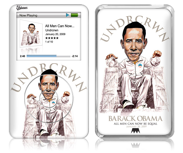
Undercrown's got this nicely illlustrated Obama skin. It's one of the more tasteful designs of Obama, in my opinion. Credit: hypebeast
Popular skin maker InCase has teamed up with Artkip for these limited edition skins and apple accessories. Pretty sick. Credit: hypebeast

I found this case on Karmaloop. InCase also has this solid metal finish, which is simple and clean. Credit: karmaloop

VERS has this wooden case, available in three different wood finishes. It's a great carrying case, but I'm not sure I like sliding the iPhone out so often. Credit: urbanoutfitters.com
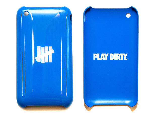
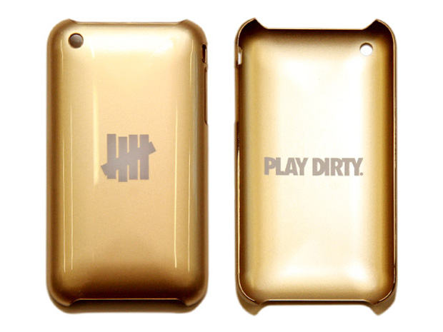
Undefeated has some really cool colorways for their series of iPhone skins. I like these because they look very out of the ordinary and loud, which is just my style. Credit: hypebeast
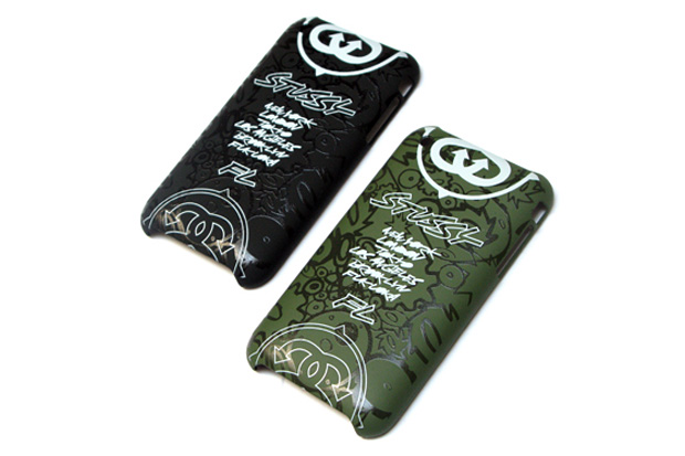
STUSSY meets FUTURA LABORATORIES in these two colorways. I'm a big fan of matte finishes. Credit: hypebeast

Stussy has this smooth clear iPhone case simply decorated down with their signature logo. Credit: hypebeast
Sunday, November 22, 2009
moloko

Subtle beauty, pleases the senses. The colors are nicely chosen and woven together. Great photoshop work here.
Saturday, November 21, 2009
Taipei has an ABC-MART!!!

So one of the things I love are shoes, although space limitations don't allow me to have the chance to buy so many, However, whenever I hit up Japan, one of the more people and price friendly places i hit up is ABC mart and upon a stroll through ximen, i was shocked to find one there. The selection is just like what I remember in Kansai, same setup and shoes. It's great to see a great chain make it to taiwan.
REACH sighting in Nanking rd.

Another REACH sighting for me. Although this is my first post about it, I saw another at a crosswalk. I like seeing stuff like this as I walk around and people might not know what the heck i'm gawking bout, but its worth it.
GO REACH!
BAPE x CHOCOLATE

So BAPE and Chocolate had a recent collaboration and their t-shirts were sold out in a day. I had my HK buds scout but to no avail. All they had were caps and I had a friend coming in from HK to visit to courier it for me. Looks great. I'm happy, even if its a little too snug and small for my big head.
Monday, November 16, 2009
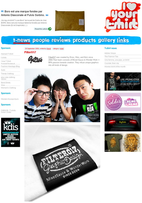
Filter 017!

Finally, some decent designers in taiwan. I've been searching for a while for something edgy or on my wavelength as to what I'm into and even the level of quality I think garments deserve, if you're going to pay top dollar for them. Packaging has been far too overlooked here and I think attention to every detail, including labeling, tag, packaging, copy, etc is important for a 'wholeness' a product deserves.
I'm going to scout them and see what they're about. I like what I see with Filter017. They seem to have already established themselves, or given themselves a start. I've already begun just simple messaging so let's have fingers crossed a nice meeting in the future would suffice for some good collaborations :)

海盜團x船長(線稿)

Another great piece, more noticeably its all because of the heavy lines. I like analyzing line work, and even without color I feel it has this rugged look I like when I read manga.
Great stuff!
Sandiman

A new artists scoured from Flickr. I like the visual here, its sort of creepy to think what's going on, whether he's being eaten or committing suicide, smiling?
Reminds me of seppuku.
WEAR IT WITH PRIDE

A recent t-shirt design from "Like Minded Studio", aka the brainchild of Luca Ionescu. I've always loved his type designs, and its great to see another type piece brought to life.
Where The Wild Things Are

I like this rendition of 'where the wild things are'. I only with there were more stripes and horns. The kids also needs to look more devious, thats the one that creeped me about the character as a kid. I think if this were a children's novel cover, it'd work just the better.
BAPE Gets Creative
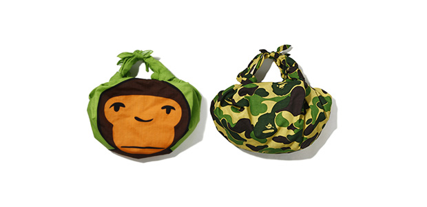
For their Kyoto opening, BAPE goes old school with this 'furoshiki' in two iterations. I like baby milo's new painted style, and I think it'd look great across the shoulder. I'd pay for this actually, but I doubt I'd be in Osaka area anytime soon, especially for a limited edition item, which most die-hards line up overnight for.
Source: http://hypebeast.com/2009/11/bathing-ape-bapexclusive-furoshiki/
ドラエーとけい

The world's most beloved robot cat gets plastered onto wrists worldwide with a teamup with NOOKA. I'm on this, if its affordable! I'll try to keep an eye on the release date.
Source: http://hypebeast.com/2009/11/doratch-nooka-zub-series-watch/
Dark Poo(h)!
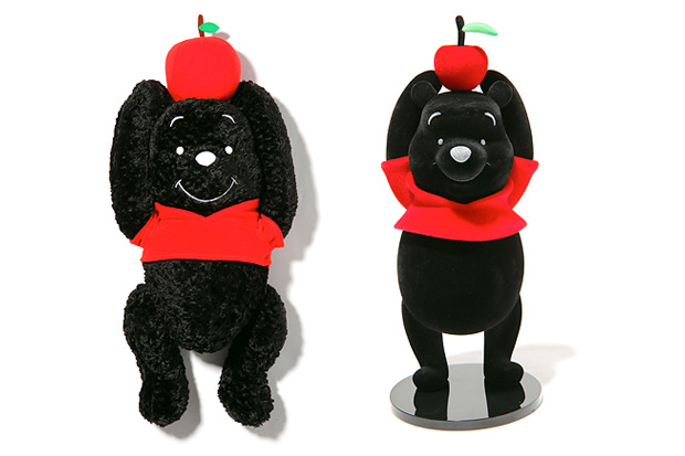
Pooh gets a makeover through designer Hiroshi Fujiwara's reimagining. I'm glad he didn't get lazy and just do a recoloring, but it seems like a rebranding of sorts with changes in material and a little style.
Source: http://hypebeast.com/2009/11/winnie-pooh-hf-version/
It's COMING...
 It's COMING..., originally uploaded by frc37.
A sign of things to come as I do more exploratory design work with animals. If you've been on my wavelength, you've seen a common theme of drawing animals. I suppose its just a phase but I went from robots to animals. Wonder what's next.
Well, this new series is apart from the 'gentleman' and 'WWRTW' series. Stay tuned for updates!
Wednesday, November 11, 2009
Two for da money!

After almost a week in the northern part of the island(i've moved to Taiwan for those uninitiated), I drew up some sketches and came up with these two silly additions.
I felt the hat thing needed something else after the first two, and so I had time to ponder different head gear and came up with a few, like headbands and masks.
Visit my flickr at www.flickr.com/photos/teacher_evan for upcoming updates on my work in progress!

Sunday, November 8, 2009
Argh Comics
 I spotted this while reading a design book at Eslite the other day. This is Malota Designs piece entitled "Argh! Comics". I definitely like the style, because they sort of look robotic. It's simple and effective, very interesting to look at and its a different layer of cute.
Hit them up at http://www.malotaprojects.com/.
Weird plant

I'm fascinated by the weird shapes that come out of this piece. I like the overlay, and what can be seen throughout the piece. It sort of reminds me of "patapon". I especially like the subtle tones created by the gradients. Simple yet effective.
三義通霄_藝樹人家插畫001

Whimsical, colorful, and imaginative. This looks like a great tourist poster for disneyland or something. I like how everything's larger than life, beyond boundaries.
Friday, November 6, 2009
Nike Sneaks
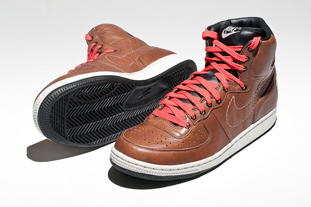
WOW, a nice pair of sneaks. Since I'm in asia now i think there will be more opportunities to find great finds like this. I'll be keeping my eyes out this for these.
Original article: http://hypebeast.com/2009/11/nike-sportswear-terminator-supreme-qs/
Wednesday, November 4, 2009
天生的無法抗拒 粉紅系列!

I love NIKE ads, and although this reminds me of my own nike mock, not sure what it has to do with nike beyond wearing the shoes. But its a great touch to have it color-themed.
Let´s yo-yo! (LaFraise)

I like the colors and linework here, and it really reminds me of japanimation for some reason, along with some disney stuff. The character's really interesting though, but i wonder whats the idea behind it?
"Candy Cane" portrait

Whaaa hair and lots of 'stuff'. Yahhh, i got mind on my money and money on my mind.
Spot The Tiger project

Wha... more amazing work discovered today. I like the details in all the different characters and their personalities. Great colors!

Grizzly!

The colors here are bold and I like the style here. Reminds me a bit of art deco, and i like the bear's face. Its a great piece of work from an interesting artist.
ooo

The blurring is a little confusing here but I guess it works if we're trying to draw more attention to the face. I like the expression here.
(illustration) Playing Band

The colors and shading here are great. Although I wish that bird in the middle wasn't there, its a bit distracting and it becomes the focal point, which distracts from the band. But great detail here, especially in the shaggy hair.
Em processo

I like the texture of the shirt here along with the line work and shading. It stands out a lot.