Thursday, December 24, 2009

Bodyguards & Assassins(十月圍城) Review


After trying to get into a decent showing of "avatar", I decided to settle for second best and watch what was next on the list, "bodyguards & assassins", an all star cast historical drama about Sun Yat Sun and one of his visits to HK, and the many assassins waiting for him.

I didn't do that much research on the movie before watching it, but I knew that Donnie Yen was in it so it made me want to watch one of his movies on his turf. It was a good sign to see that almost all the seats were filled, just like Avatar. The other movies in the running this weekend were "Twilight: New Moon" and "Storm Warriors II", which were pretty empty and pathetic. They didn't look to appeal to audiences anyway.

"Bodyguards & Assassins" has been advertised to have built the biggest recreation of old time Hong Kong in history, and it was quite apparent they did quite an impeccable job. The set pieces are done so well, its amazing to see such attention to detail. Although the mustache on Eric Tsang was a bit hard to believe.

The movie has a slow start, with a quiet beginning setting up some of the relationships you need to know to make the later events much more of an impact. What I did like was that most of the characters were not in traditional roles they are usually in. For instance, Donnie Yen, most famous for his masterful performance in "Ip Man" is now relegated to a fledgling soldier, who has gambling problems and does anything for the right price. There were only 2-3 moments that were somewhat cheezy, but thats it. For the most part, they got the acting right with most of the scenes regarding China, reunification, guomintang, and family. The non-action scenes played out well, and told the story well.

The problem with a movie with so many characters is that there's only so much air time and so you can't get invested with any of the characters and there's too little time for development. They did well with the time that they had, although i felt certain characters like father character that orchestrates most of the events tends to be almost outwitted and left out of the most pivotal parts of the movie, for some reason. I felt it was a buildup of that character that doesn't really play out right for the audience.

The buildup is what they try to set up in this movie from the beginning. The whole Sun Yat Sen scenario is brought up at the beginning of the movie and in various instances in the movie they will inject some text indicating how many days until he arrives, like a countdown to some big big moment. Therefore, you'd expect the event to be momentous, and the climax of why you've been sitting there watching the events unfold the way they have. Bottom line, they did a good job satisfying the customer. The whole journey from when Sun Yat Sen arrives is very violent. I had hoped the 'bodyguards' fighting off the assassins had worked together more, but instead they all had their own vendettas and reasons and therefore each one had their own little scenarios. It was satisfying to see the overall picture, but some of the action scenes were a little too fast and the camera was intentionally shaky but it was just too hard to read sometimes.

However, as a martial arts epic, this one is different in that you have more raw fighting than you do "flying". Nobody flies in this film, and the weapons cut with blood spewing about. The only character with martial arts mastery is Leon Lai's character, who masterfully beats down a crowd of assassins with his metal fan, but unfortunately the scene isn't long enough, in my opinion, but he does a good job of protecting, as he is asked of.

As a whole, this movie accomplishes what I had thought it had set out to do, with stronger acting, dialogue, and drama than the martial arts, but there's no skimping on violence. The cast is strong and romances and maybe over-dramatizes the actual event, but it leads to great film-making and definitely satisfies those who are looking for a good martial arts epic.
Bookmark and Share

Wednesday, December 23, 2009

James Cameron's "Avatar"


James Cameron's "Avatar" has been getting rave reviews. I've been doing a lot of reading on it and getting positive reviews through word of mouth from friends on facebook, so it sort of bumped up my negative anticipation towards it. I think the media was all right by saying that they marketed the movie wrong. It's not exactly an action movie, but more along the lines of "District 9" where you become them, and then join them and fight back. It's not as political and thought-provoking as "District 9" but it does have heart and some parallels with military and colonialism. I even find it funny people are comparing the movie to "Pocahontas". That makes sense, except you gotta give Pocahontas some poison-lined arrows and a banshee to ride upon (don't forget to give her hair with mind-connecting tendrils). The movie itself, is awe-inspiring. As a whole you can view it as James Cameron's triumphant return to his sci-fi throne, wetting the appetites of fanboys worldwide with gun-toting mecha, ground-breaking graphics, and, of course, Sigourney Weaver.

I can say I was NOT a fan of the 3-d. It was great to see it, especially towards the beginning in the opening cryo-scene, but after that I didn't see that much of a big deal, especially since I'm a hobby gamer and I'm more enthralled this past year by games like "Uncharted 2" and even throwback to "Metal Gear Solid 4". The 3-d was definitely designed with the intention of being used with the movie, and kudos to Cameron for always trying to push boundaries, like he did with "Terminator 2", but I felt it was unnecessary to enjoy the experience. I did get a headache at the very end, but I get headaches from first-person shooters. But I felt it nauseating to have my senses overloaded, and all the while I had many question marks at the end of the story.

How did they learn English? I was never exactly sure when the main character, Jake Sully, asks Neytiri. Then everyone starts becoming bilingual. I'm guessing Sigourney taught them. Secondly, I felt they skimped on character development. They never fully went through anyone's character past, but only briefly touched on them. I felt less attached to most of the characters, and so I cared for them less. I liked the character development of Jake and Neytiri, but that was as we went. Although this was not a movie that has flashbacks, I did feel it kind of strange how certain events played out, like why was Neytiri out on her own or did Jake get fake prosthetics or something? Or was he born like that? Sooooo not sure how it was playing out. They did a good job with pacing and developing how Jake gradually changes from human to na'vi, but I found it was just like an imax experience, and I just wish there was more we knew about Grace(Sigourney Weaver), or the roles of that "other guy", the scientist/botanist that had a gun and also had an avatar.

Visually, what can I say? Cameron succeeded, beyond those doubts(of which include me) that these ugly aliens and their neon colorful planet had some worth, and it was more than a realistic CG film like "Final Fantasy: the Spirits Within" and more like an iconic film. I must say though, the memorabilia is cheesy. The movie is watchable, but I don't want to remember a lot of it later on. What I mean is, you won't find action figures, stuffed animals, and those awful toys I saw at McDonald's, in my room in the future. It's a great movie, but it doesn't have much in terms of likability in the character design.

"Avatar" gets no bias from me. I still treat it like any other movie I see, and I would still give it 85% because of its achievements, and all the effort I could see the entire team put in to push it just as far as they did. The story leads much to be desired from me, but at the same time it does stand up on its own, especially when you compare it to most of the dribble you see these days. Glad to see Cameron's still got it!
Bookmark and Share

Friday, December 18, 2009

Go IRONMAN!


Kudos to the sequel to IRONMAN. I just saw the teaser trailer to the second one and there's a ton of characters introduced(sadly no Mandarin), but Black Widow and ALREADY the introduction of War Machine are just huge additions. I'm still not convinced the wrestler playing this electro-whip guy. To my recollection, he was never that big of deal and furthermore, I have a peeve about fake accents. Especially considering it sounds so obvious.

Although it was cool to see Ironman and War Machine fight side by side at the end, I was more enthralled with Ironman flying through the air dodging gunfire. It brought memories of that old 90's movie that everyone forgot about: "The Rocketeer".

Anyway looking forward to this one this summer.
Bookmark and Share

Wednesday, December 16, 2009

Robot Sighting!


Another life-sized robot has been sighted in Nippon. Tetsujin-28 has been unveiled in NIPPON! Crap, what a time NOT to be in japan. If you're in the KOBE area, check it out! Last time I was there, all I found was h1n1 so i avoided the area. Now's the time to plan!

I still want to see the life-sized mobile suit gundam :(
Bookmark and Share

Monday, December 14, 2009

The Beginnings of Cute?

I've been wanting to write an article about "cute" in this day and age, but I haven't found time to. First and foremost, I am not trying to offend anyone or defame anyone's own creative art. Everyone is entitled to their own creative opinions, albeit controversial or not, and I always encourage creative and constructive feedback. I respect everyone's work here, and am only trying to draw upon comparisons based on observations.

So Japan has always been revered by me as the birthplace of what I call "happy-go-lucky cute". What this means is big shiny eyes, super cute animals, pastel colors, hello kitty, you get the picture.

Now I'm a big fan of the community on flickr, as most people know, and it by far hold some of the greatest talents on the planet. Upon my browsing, I've noticed a common trend, and I just want to prsent some candidates below before continuing. The question here is "who started it?"


Yo Amo La Leche


Andres Guturo


Marcelo Pellizo


Fo-Fotz


Tokidoki

Ice and Kream

Ok, so now that you have seen the subjects of my discussion, I am wondering your thoughts and where I am going with this. There are many similarities of course, and some are more well-known and iconic as others. The more obvious choice is TOKIDOKI, which has a worldwide reach, and a similar brand is TADO(below). Let's not forget KID ROBOT, with their endless supply of vinyl cute. This is all an established market.


Now my point here is simple and quite clear, do the similarities warrant artistic license and respect for originality, or is a style warranted creative freedom? There are BAPE wannabe's out there but they're far and few, because they don't survive long enough. As for the state of the cute industry, that's a different story. I personally all categorize them under the same genre, but I feel there is a means to carry out the same message, while not directly 'copying' or imitating.

Is there nothing harmful about a case such as this, or is this considered cashing upon someone else's market they've taken years to establish?

For me, I think its too similar. I feel there is so much room for growth and innovation, but its probably going to be explored by an industry leader for they have the experience and "opportunity" to explore what succeeds and what does not.

Beginnings of cute? Who came first? I don't know, but this is all something I'd like to hear about and explore further.
Bookmark and Share

Sunday, December 13, 2009

DALEK's new show


At my old job I got to work with some of Dalek's work, aka James Marshall and its great to hear he's got some new stuff. Although, his space monkey stuff is what I recognize more, but the colors and linework he does here are great. Check out his work at:

James Marshall “And There Was War in Heaven” Exhibition
Jonathan Levine Gallery
529 W. 20th St
9th Floor, New York, NY 10011.

Source: hypebeast
Bookmark and Share

Christmas Bearbrick


I'm not usually a fan of christmas-themed items, since after the fact they seem rather outdated and useless. However, this is really well done. The glow accomplished turned out really well. I personally only collect the small ones, since I find the big ones to be rather a space hogger.

Source: hypebeast
Bookmark and Share

Thursday, December 10, 2009

Year of Astronomy Poster 09

I really like this imagery. It's simple, yet modern. It doesn't need too much, and the symbolism can already communicate so much including eclipse and orbits.

Bookmark and Share

Order To The Galaxy


Order To The Galaxy, originally uploaded by DTH/CLR.

A mask to rule all. I love the balance here, and the iconic symbol. Although it might be harder to recognize without the helmet to non-geeks, but its still a great icon.

Bookmark and Share

Fashion hairstyle of Japan


Fashion hairstyle of Japan, originally uploaded by FLOP DESIGN.

Meticulous linework here. I'm a big fan of hair, and also japanese fashion mags so this is a great representation. I could see this for a cosmetic ad or shampoo line. I love the attention to detail to create the weight of the hair. It takes a long time, i should know. I deal with drawing hair quite often but never to this extent.

Bookmark and Share

exhibition poster


exhibition poster, originally uploaded by mil3n.

Much admiration here to the poster, for its handmade qualities. It's gone so digital lately and yet, to know that some stuff that LOOKS digital but is done by hand is reassurance that the craft hasn't lost its roots.

Bookmark and Share

Wednesday, December 9, 2009

Peat Wollaeger!


peat_wall_miami, originally uploaded by ☆ peat ☆.

Famous stencil graff artists Peat doing up some work in Miami! Great to see him still up to GOOD with what he's known for. Sick stuff!

Bookmark and Share

cityslickers


cityslickers, originally uploaded by theory_one1.

Theory One is in da house with another sick work. Although its a rework of his, its still a great improvement with nice visuals here, overlays, and really brings the surrealist idea out.

Bookmark and Share

69


69, originally uploaded by vitordumato.

A simple concept told through iconography. Ha ha, the color overlays work well here to tell the story. Great workup.

Bookmark and Share

HEY!


HEY!, originally uploaded by dxxxtr.

Great play of type and imagery here. I like the monotone colors here. I'm not familiar with the song but the hair totally reminds me of Kidd from "kidd n play" back in those 'house party' days.

Bookmark and Share

STARWARS


STARWARS, originally uploaded by EXKARRAVELHO.

Great reductive here. It never ceases to amaze me how iconic star wars designs are, and how they're easily the most recognizable figures in pop art these days. Although some people here in taiwan get "star wars" and "star trek" mixed up, STAR WARS is easily the more iconic and adventurous.

Bookmark and Share

What a pair!


DSC06783, originally uploaded by Śūnyatā.

Zany shapes, great textures, interesting swatches, monotone colors. An interesting matchup of sorts, with raw imagery. Thumbs up for creativity.

Bookmark and Share

GTI


GTI, originally uploaded by ♧ 小 孩 ♧.

I actually did see this car on the road earlier this month, a red one too! I like the simple, bold design here. The car isn't the greatest looking, but it has a design representing an era. Reminds me of those cold Jersey winters waiting while this bugger warms up with its lawn-mower sized engine.

Bookmark and Share

2535-九月號人物(男)


2535-九月號人物(男), originally uploaded by TuBo 土波.

A recent entry by TuBo. The gesture and shading are great here, realistic and manga-inspired style here. Be sure to keep on his photostream. He's got some great energy in his work.

Bookmark and Share

Monday, November 30, 2009

It's Funny?


It's Funny?, originally uploaded by frc37.

So it started out small and grew. The idea was simple, set up something unexpected, borderline gross and run with it. Don't think about whether its weird, whether people would like it or not or what they'd think.

I saw a news report on tv the other day about these dolls that were selling in taipei and how the weirder it was, the more it'd sell. I guess the attention is one thing, but i think it gets the brand out there, negative or positive publicity.

So now its the the concept of cats starting to come out of their shells, their human shells. Now they're starting to take over and show off their personalities.

The two parts are fun to do. It's a different method from my other works, since the cats are mainly done in photoshop and the humans are completely done in illustrator. Putting it together is a more difficult task, to get the sizing right.

The slogans though, since it started as a teaser with "it's coming" is now set as the theme.

Check out more on my flickr at www.flickr.com/photos/teacher_evan

or

directly to the set at http://www.flickr.com/photos/teacher_evan/sets/72157622781887329/

Bookmark and Share

corrid rabbit


corrid rabbit, originally uploaded by sr.daniboy.

Shaped like a revolver, so appropriate. I didn't understand the imagery right off the bat but from afar, i totally got it. I like the expression of the rabbit, totally appropriate.

Bookmark and Share

Dalai Yorke


Dalai Yorke, originally uploaded by My Happy Design Lab..

This guy's got some amazing work. His photography is elegantly filtered to bring out this quality in the characters. I like the model's expression too, which doesn't say too much but speaks volumes in the mind.

Bookmark and Share

Digital Collage for Raso


Digital Collage for Raso, originally uploaded by novacreativa.

Great symmetrical collage here. I especially like the inclusion of mazinger z up at the top. The psychedlic color scheme reminds me of a mix between old French posters, 70's hippie posters, and heavy metal iron maiden-like posters.

Bookmark and Share

bmx nirvana


bmx nirvana, originally uploaded by Raid71.

I like the fluid movement here and execution. Raid71's a bike enthusiast, more specifically bmx so its great to see how people can succeed based on their passion. Really great.

Bookmark and Share

Sunday, November 29, 2009

A Design Report: Taiwan

So my quest to see the design world in Taiwan has come to a long-awaited thesis. Taiwan, an odd place to me that I can’t say represents something as prominent as Japan in the world, is a curious creature. It’s hard to put my finger on it, but I can say what I’ve seen and experienced in my short, yet fruitful design life has given me a lot of perspective and a good scope on what I should look out for.

My foray into studying the design climate in Taiwan is to 1)see the level of creativity and depth the art movement Taiwan is at, 2)see what the community takes to and understands, 3)see if it is feasible to bring a new idea here as basic a platform as a t-shirt line, but as complex as something new and different in art.

Upon first arriving here and beginning my research, I did some online searches and found an article about how Taiwan lacks creativity. The award winning entrees into competitions have been found out to be rehashes and recycling of ideas others have done from all over the world, which is a bit of an embarrassment to say the least but also to be expected. It states how Taiwanese designers are undereducated, and hence uncreative. However, I do feel you can still be creative without the education, but it does help and give you a deeper understanding of the craft.

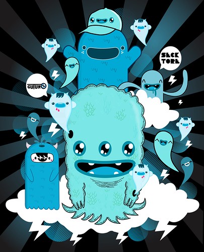
I visited the national museum of fine arts in Taichung and the one bit of pop art I found was an exhibit juxtaposing pop art icons in Japan(and Taiwan) like mazinger-z with gold idols like that in Thailand. I found that the most engaging and relevant to the art movements in the pop-culture world. The remainder of what I’ve seen in museums in Taipei and Taichung are relatively traditional. Calligraphy, historical photography, and abstract painting were the majority of what I saw. A movement to move the abstract art world towards a direction towards more relative pop platforms is a good idea, but I have yet to foresee that happening. Art in itself remains somewhat set apart.

Something to notice is looking at street signs and billboards and how for the most part they all look to be done by the same person. That may even be the case, but signage lacks a level of sophistication and innovation that I have seen in other countries. It could be rooted in color choice and local superstitions, but that could also not be the case and we could just have a lazy designer.

The culture of Taiwan is to make money, and since they rely more on importing than exporting, the Taiwanese consumers would not know as much if they were being swindled or dealt a recycled idea. Even if they did know, I don’t think they would care that much because they’d pay less for something quite similar to the real thing, which is quite different compared to the idealism of Hong Kong. Case in point is a brand I spotted, which I saw in a department store. I think of it as “almost BAPE” since they use a similar light colored camou and the face of their symbol/icon is so close to the “Planet of the Apes” face but not quite there. I do notice the BAPE store in Taipei usually empty but then again, I think they want it that way; peaceful and catering to the ones that are worthy of the brand. But at the same time, the way the economy is and Taiwanese people are, only a handful are gutsy enough to put down enough cash for some real authentic BAPE. I told my friend that I would think it is so shameful to do something like copying a brand because, not only is it blatantly obvious and they can get away with it, but I just have too much respect for some designers in this world that put thought into their work, to take that and claim it as my own and be as mindless as to just copy and not think up my own work. I can’t even begin to imagine how planning sessions are for the designer who just rips off another’s work.

Currently succeeding trends have been Japanese and American imports that are sold at boutiques and department stores, but that’s high end. As much as these t-shirts are popular in terms of design and visibility, a problem is whether they sell at the right price points and to the locals. As far as I’ve seen, teens to adults still wear t-shirts, especially due to the climate, but the English is a little all over the place. The messages are fairly simple, with some sort of iconography with accompanying text that makes little sense. It’s similar to japan with things like LOVE, HAPPINESS, PURE 100% but they’ve also improved in their grammar(a little bit) and punctuation. In Taiwan, it still remains to be quite a problem as spelling and meaning are absolutely lost. Think of it as Westerners have Chinese tattoos which make little to no sense.

I think the grammar issues are less of a problem in terms of understandability and comprehension, but if products in Taiwan and the “made in Taiwan” moniker are to have a more positive and renown image, then exportability is a factor and Taiwanese brands need to excel in all aspects beyond competitors and quality needs to be more closely looked upon over quantity and sales. You may have a cheap find for the masses, but whether its special, lasts, and retains its image amidst others is another thing. Lasting quality, functionality, and lasting interest. These are things I’m looking towards.

There are a few brands I saw as unacceptable, and a tad tacky. BSX has a bape-like Milo-esque iconography. The problem is its too similar and the characters they have are unoriginal. They have Ultraman, Robocop, spiderman, wolverine, etc and Lu Guang Zhong. The last one is the only original one I’ve seen, and that one I’ll give them but the others are beloved trademarks that have no message or purpose rather than to use their status. It’s one thing to take an icon and add upon it for a message or a given purpose or theme, but just to use the likeness for no intended purpose is shameful.

Ecstacy is another brand, trademarked with some sort of hose-like SD creature. This one I just pass by but rarely take a look. The artwork is too simple and has been rather the same for years, that there isn’t much worth of development or improvement. It’s one thing to have a trademarked icon like POLO, but this is just a cartoon character which is not interesting enough to follow.

Powpowpow.cc is a brand my friend Honda showed me and initially I was impressed. It almost had the same business model I had wanted, to give artists that had not following or background a chance. Think of it kind of like threadless.com sold in stores. Some of the designs I saw were not bad, although the subject matter is questionable. However, after some review I found it not what I was looking for. They let almost anyone in, and have no quality control. The artists seem too amateur, with no sense of any formal training and guidance as to choice of subject matter. Juxtaposing iconic figures like Ronald Mcdonald to Cookie Monster with a concept like cannabilism might sound good on paper(or maybe not that even), but the execution was not on par for sale in stores and the overall drawing lacked a refinement I would expect for the price point. Overall, pretty darn disappointed with the lackluster designs(almost 90% awful in my eye).

So in my review of what didn’t work in Taiwan, I have concluded that there is a lack of a good eye, which is missing in a lot of shops in the world. I’ll still find the same lame designs in the U.S., Japan, etc. Nobody’s perfect, but its all a call to action to save consumerism and improve quality by upping the standards, rather than relegating to rehashing the subpar for an extra quarter.

Current brands I have found to have acceptable quality are Pizza Cut Five and Graniph Design. The former being a Taiwan company, I felt the presentation is great but the t-shirts were under-utilized. I was unsure that people were jumping on and grasping on to the brand’s image, and although graphically they were engaging enough, I still felt they were rather flat and needed an extra push to take them off. The latter, is a Japanese brand that has plenty of cool t-shirts with some nice motifs I recognize from famous artists. However, I’m not entirely sure people can tell the difference between this design and the ones they can find on the night markets.

What I looked for in these brands were soft material, softer paint, and complexity of design. T-shirts like Hanes beefy tees are easier to find, and are not comfortable in the long run and wrinkle upon drying and wash. They are not the best at handling heat either. Cheaper paints are bolder, with less depth in color(like gradients), are thicker and peel and wrinkle after a few washes, and smell bad like chemicals. IN terms of design, I’m looking for something different, more importantly humorous. The consumer needs to feel special, and when they see themselves in the shirt, they need to have a conception of what they’re wearing or enjoy it. The plain answer is I like this design because “it’s cute”. The answer I’m looking for is, “The concept reminds me of a dream I had and makes me smile when I see it in the mirror”. It’s a hard goal to attain, but I like the challenge.

Trends in terms of design are very simple. Cartoon figures, very simple SD forms, flat non-shaded imagery. These are mainly “born” in Japan and or are rehashes of Japanese designs. Designs are plastered on t-shirts with flat paint, puffy and perhaps a little to mechanical in my eye, and many times not done with the best eye for quality. Upon examining the consumer and the product, I find consumers are drawn to cartoony figures as a trend, with cute factor being where design is at this point in Taiwan. Consumers don’t necessary look at the quality as much so as much as you have your share of department stores, night markets, and boutiques where the t-shirts are hung on racks with plastic covering, they all don’t matter one bit when it comes to quality and utilization of the design space.

In the U.S. we have more flocking and full coverage of the t-shirt area as a while compared to the canvas area just being front or back. Although this is just a trend you can find a la “Ed Hardy” or “Affliction” t-shirts, its something perhaps underutilized or explored here leading to a very one-sided and pigeon-holed view of fashion. The design area is a big factor in t-shirts and is something that is quite unexplored. Rather, if there are t-shirts that go against the trends, they are usually imports from the states, and therefore many times its not as visible.

Currently the trends in Taiwan are relatively slow and I find for the most part, because of the economy, people are quite poor and unable to fully grasp “taste” and choose as one should when looking for their own personal style. I find some people quite capable of emulating a style that you find in the magazines, something you can see a level of preparation and creativity. However, this represents 15-20% of what I see, while the general population is still stuck in what I call “lazy fashion” which consists of sleepwear, worn out tennis shoes, and streetwear. The GQ trend of H&M is still relatively unexplored as people don’t know how to put it together here. Slim fitting shirts are available but are people ready or able to put It together is another question.

My vision thus far has been to create something, I now realize, is similar to the Artsprojekt motto of liberating artists and trying to create a platform of availability to the masses. However, I would first start with myself as the sole contributor and experimenter. I want to concentrate on creativity and quality, two key aspects. I want the price point to be moderately affordable, but it depends on the line. I’d start with a general more affordable line but I guess depending on the theme, the seasonal design would have to be affordably made. I’m going to opt out of two simple of a design as it will become just a competitor of the pre-existing. Instead, I’d like to start a trend and create and inspire competitors for myself. I want to explore new avenues of design to try and appeal to the masses and influence how you wear a t-shirt. Coupling a design with your current wardrobe is something not very well thought out. Sure, you can go with a jean or shorts, but that doesn’t take much thought. What if your shirt complimented your pre-existing wardrobe, that would be awesome and requires a lot more thought and depth on the consumer, but its well worth it.

I wouldn’t want to dwell on a certain idea for too long, but rather keep it moving and reinventing itself. My whole purpose is not just to make a profit, but to inspire a new trend to move forward the movement and elevate the quality of work here. So for instance, if you look at Uniqlo there is such a varying level of designs ranging from designs for girls, designs from European graphic artists, tributes to cartoon characters, etc. That is the level I am looking for, a platform and space that is new, different, not overly self-promoting, but rather letting the material speak for itself and having a presence and visibility that spreads through word of mouth rather than over-marketing. I want it to have some grass roots beginnings, some very basic beginnings and a positive experience.
Bookmark and Share

Thursday, November 26, 2009

Tu seras là?


Tu seras là?, originally uploaded by royliuben.

I've been seeing a lot of animal hats lately. Well, lets not forget to mention all the animal hats I've been making in the last month. Anyway thought this pic was relevant.

Bookmark and Share

Verbal on November's OLLIE


Verbal on November's OLLIE, originally uploaded by frc37.

This is a bit late, but I pass by this mag every day now as it is laying in my room. I bought it yesterday but saw it for a while on the racks but just never saw a good moment to pick it up. In November's issue of OLLIE, Verbal, one of Japan's most influential harajuku fashion starters is once again gracing the cover for some sick threads. Although i preferred the last one he did a year ago or so, this one's great too.

Bookmark and Share

Dolls... i THINK tofu related


Dolls... i THINK tofu related, originally uploaded by frc37.

Stationary stores in taiwan are pretty awesome. They're filled with some of Japan's best innovations. Also, cute figurines with amazing craftsmanship. Although I'm not in the market for this stuff anymore, I do still find it fun to watch.

Bookmark and Share

Tuesday, November 24, 2009

Rated R


Big shout out to Rihanna for the debut of her 3rd album, "Rated R" in stores now! After a clean run through, I didn't find any hiccups. Well put together, elegant and strong this third album compiles and "picks up" after the drama and history of events with Chris Brown a year ago, and it really shows the great craftsmanship put into hte lyrics to explicitly convey the raw emotions of this resilient talent.
Bookmark and Share

iPhone skinzZzZz

So now that I'm in taiwan, I think there's plenty of things to blog about in terms of design, whether I'm out on the street or in a department store, I usually find something worth talking bout. So I figured it might be time to get an iPhone, since coming back home to do little blog posts is a bit of a hassle. So to pair my gunmetal black macbook is my new black iphone, but its still a bit fragile for my taste so a shell/skin is appropriate. Although I doubt I can find a lot of these(below) here in Taiwan, I'm sure I'll find something worth skinning my phone.

However, I found some tasteful choices that I thought I might share, whether you know about it or not. These noteworthy choices are clickable to their sources, so check them out for more information, and some are available for purchase if you're in the states.


A second design by reknown Japanese designer Fujiwara Hiroshi. Credit: hypebeast


Undercrown's got this nicely illlustrated Obama skin. It's one of the more tasteful designs of Obama, in my opinion. Credit: hypebeast

Popular skin maker InCase has teamed up with Artkip for these limited edition skins and apple accessories. Pretty sick. Credit: hypebeast


I found this case on Karmaloop. InCase also has this solid metal finish, which is simple and clean. Credit: karmaloop


VERS has this wooden case, available in three different wood finishes. It's a great carrying case, but I'm not sure I like sliding the iPhone out so often. Credit: urbanoutfitters.com


Undefeated has some really cool colorways for their series of iPhone skins. I like these because they look very out of the ordinary and loud, which is just my style. Credit: hypebeast


STUSSY meets FUTURA LABORATORIES in these two colorways. I'm a big fan of matte finishes. Credit: hypebeast


Stussy has this smooth clear iPhone case simply decorated down with their signature logo. Credit: hypebeast
Bookmark and Share

Sunday, November 22, 2009

moloko


moloko, originally uploaded by noodle_inc.

Subtle beauty, pleases the senses. The colors are nicely chosen and woven together. Great photoshop work here.

Bookmark and Share

Saturday, November 21, 2009

Taipei has an ABC-MART!!!


Taipei has an ABC-MART!!!, originally uploaded by frc37.

So one of the things I love are shoes, although space limitations don't allow me to have the chance to buy so many, However, whenever I hit up Japan, one of the more people and price friendly places i hit up is ABC mart and upon a stroll through ximen, i was shocked to find one there. The selection is just like what I remember in Kansai, same setup and shoes. It's great to see a great chain make it to taiwan.

Bookmark and Share

REACH sighting in Nanking rd.


REACH sighting in Nanking rd., originally uploaded by frc37.

Another REACH sighting for me. Although this is my first post about it, I saw another at a crosswalk. I like seeing stuff like this as I walk around and people might not know what the heck i'm gawking bout, but its worth it.

GO REACH!

Bookmark and Share

BAPE x CHOCOLATE


BAPE x CHOCOLATE, originally uploaded by frc37.

So BAPE and Chocolate had a recent collaboration and their t-shirts were sold out in a day. I had my HK buds scout but to no avail. All they had were caps and I had a friend coming in from HK to visit to courier it for me. Looks great. I'm happy, even if its a little too snug and small for my big head.

Bookmark and Share

Monday, November 16, 2009

Filter 017!


Cap Packing, originally uploaded by Filter017 Graphic Design..

Finally, some decent designers in taiwan. I've been searching for a while for something edgy or on my wavelength as to what I'm into and even the level of quality I think garments deserve, if you're going to pay top dollar for them. Packaging has been far too overlooked here and I think attention to every detail, including labeling, tag, packaging, copy, etc is important for a 'wholeness' a product deserves.

I'm going to scout them and see what they're about. I like what I see with Filter017. They seem to have already established themselves, or given themselves a start. I've already begun just simple messaging so let's have fingers crossed a nice meeting in the future would suffice for some good collaborations :)


Bookmark and Share